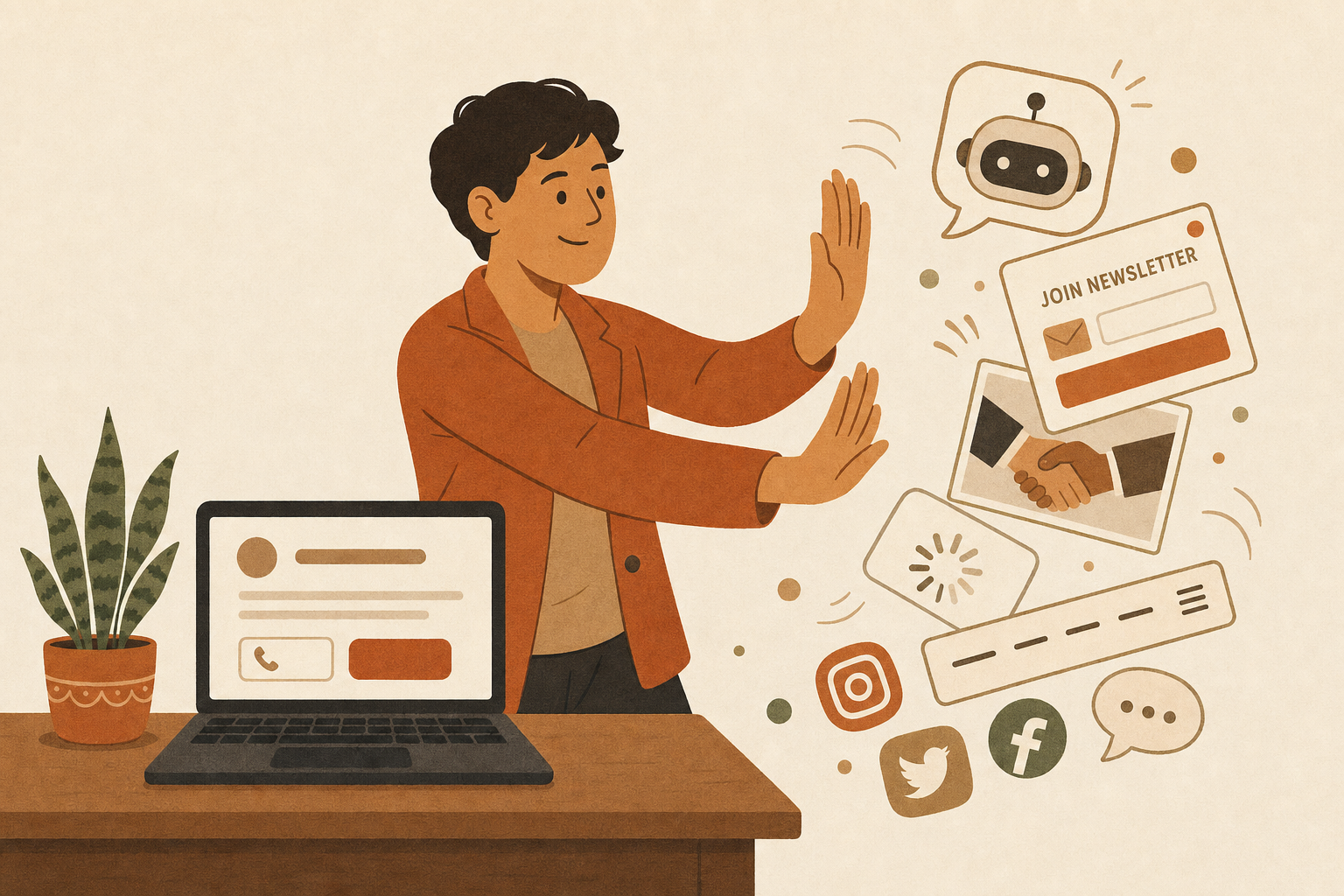
Every article about small business websites tells you what you're missing. More pages. More features. A chatbot. A blog. A pop-up. A funnel.
I want to do the opposite today. I want to tell you what you can skip.
Because here's a thing I learned over fourteen years of building software — first as a senior programmer on Department of Defense systems, then at the director level in the corporate world : every feature you add is one more thing that can break. In that world, extra complexity wasn't a style choice. It was a liability. The best engineers I ever worked with weren't the ones who built the most. They were the ones who knew what to leave out.
Your website works the same way. So consider this your permission slip.
A chatbot
I know. Everyone has one now. That little bubble in the corner that says "Hi there! How can I help?"
Here's the honest version: for most local businesses, a chatbot is a robot standing between your customer and your phone number. The person on your site doesn't want to chat with software. They want to know if you can fix their AC this week. A visible phone number and a simple contact form answer that faster than any bot, and neither one ever responds with "I'm sorry, I didn't understand that."
If you're a national company fielding thousands of questions a day, sure. If you're a plumber in South Georgia, your customers would rather just call you.
A blog you won't update
A blog is great — if you'll actually write it. I write mine weekly, and I'll be honest with you: it takes real time.
But a blog with three posts from 2023 doesn't say "we're thoughtful experts." It says "we started something and quietly gave up." That's a worse impression than having no blog at all, because now the evidence is public.
No blog beats a dead blog. Every time. If writing isn't going to happen, spend that energy on your Google reviews instead. Those work while you sleep.
Fancy animations
Things that fade in. Things that slide. Text that types itself out letter by letter while your customer waits for it to finish.
I understand the appeal — motion feels premium. But watch a real person use a website sometime. They're on their phone, standing in a parking lot, trying to find your hours. Every animation between them and that answer is a tiny tax on their patience. And on older phones, those effects don't look premium. They look broken.
Deliberate design earns trust. Decoration just gets in the way of it.
Fifteen pages
Somewhere along the line, business owners got the idea that more pages means more professional. So the site ends up with a page for the mission statement, a page for the values, a page for the process, a page for the team, a separate page for every tiny variation of every service.
Most local businesses genuinely need about three to five pages: what you do, who you are, proof you're good at it, and a dead-simple way to reach you. That's it. A visitor who has to hunt through fifteen pages to find your phone number isn't impressed. They're gone.
More pages also means more to maintain, more to keep accurate, and more that quietly goes stale. Small and current beats sprawling and dusty.
A newsletter pop-up
You've been on these sites. You clicked an article, and before you read a single sentence — boom. "JOIN OUR NEWSLETTER."
I wrote a whole piece about pop-ups that ambush people, so I'll keep this short: a stranger who's been on your site for two seconds is not ready to be in a relationship with your inbox. Let them look around. If what you do is genuinely useful, they'll find your contact page on their own — and that lead will be worth ten reluctant email signups.
Stock photos of handshakes
You know the ones. Two people in suits shaking hands. A too-bright call center woman with a headset. A conference table of models laughing at a laptop.
Your customers have seen those exact photos on a thousand other websites, and their brain files them under "wallpaper" instantly. A slightly imperfect photo of your actual truck, your actual shop, your actual crew does more for trust than any stock image ever will. Real beats polished. It's not close.
Every social feed you've ever touched
Embedding your Facebook feed, your Instagram grid, and your latest tweets onto your homepage feels like showing off your whole presence. What it actually does is slow your site down, clutter the page, and hand your visitor an exit ramp to an app where they'll forget you existed within nine seconds.
Link to your socials in the footer if you're active on them. But your website's job is to keep people here, not send them somewhere designed to distract them.
So what does a website actually need?
After all that cutting, here's the short list that's left:
It loads fast, especially on a phone
It says what you do in plain English, immediately
It makes calling or contacting you effortless
It gives a reason to trust you — real photos, real reviews, real work
It sounds like you, not a template
That's the whole recipe. Everything above this line either serves one of those five jobs or it's in the way.
The senior engineer's secret
Here's the part I find funny after all these years. When I was building government systems, the hardest arguments were never about what to build. They were about what not to build. Saying no to a feature takes more confidence than saying yes, because "yes" always looks like progress in the meeting.
Your website is the same negotiation, just smaller. Every widget somebody talks you into is a yes that looked like progress. The most confident thing a small business website can do is be simple, fast, and clear — and nothing else.
So if your site is missing a chatbot, a blog, an animation library, and a newsletter pop-up? Good. You're not behind. You might be ahead of half your competition and not even know it.
And if you're staring at your website wondering which pile it belongs in — the "doing its job" pile or the "quietly overcomplicated" pile — I'm happy to take a look and tell you straight. No pressure, no fifteen-page proposal. Just a free chat.